在圖書館看一些infographic的書籍,美輪美奐。無奈,它們沒有介紹如何繪製。結果,又是回到互聯網。搜尋到一些不錯的網站和youtube,度身訂造教用Adobe Illustrator(AI)畫圖。先行分享,下一步學習。
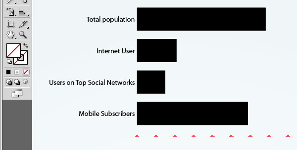
這個網頁是教畫棒形圖和圓形圖的。
作者刻意不ungroup棒形圖,而是不填滿數字軸,以及用Lasso Tool延長棒的長度,再設計成圖。
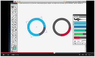
由棒形圖變冬甩圖。
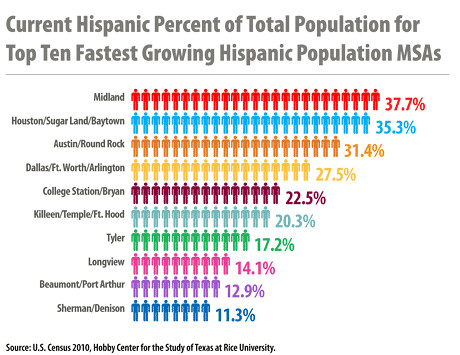
有時我們會用圖案代表數量,例如用人形公仔數量,代表人口,例如美國德州人口族群分佈。
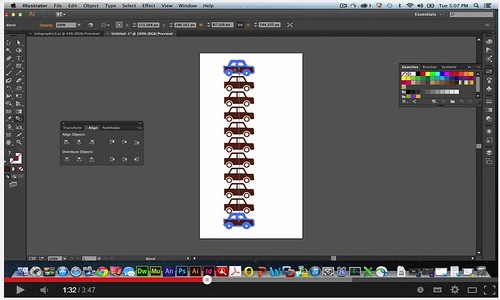
如何對齊距離和行列呢?答案是用blend tool。高鐵669億元等於33.4億盒叉燒飯,要畫圖,我估計也是跟著做吧。
這個youtube影片是教我們弄不同形狀的時間線(Timeline)的。
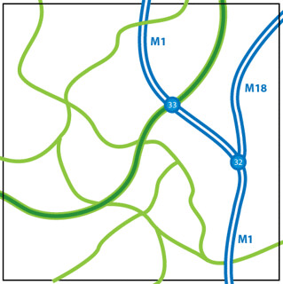
本地巴士路線重組如火如荼,如果想宣傳改動有多麼擾民,可以用AI畫地圖。(其實不少巴士迷也認識吧,不用我多介紹。)
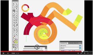
用簡單的icon來(幽默地)表達對比訊息,AI能幫手,大抵是交替用Pen Tool、Ellipse Tool和Line Tool。(要專門學Pen Tool,看這個吧。)

當然,如果有實體畫板和畫筆,比用滑鼠更順手。
【以上圖片,來自網路或youtube影片截圖。】

Congratulations!
回复删除ve may bay di my gia re
mua ve may bay di miami gia re